

Blog
French Impressionist Prints for Brighter Rooms

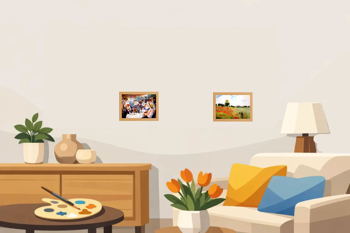
A misty riverbank, a sunlit garden, a café scene caught in passing: French Impressionist prints make a room feel considered without making it feel formal. Their loose brushwork and gentle, shifting colour bring life to a blank wall, whether you are furnishing a first flat, softening a bedroom or choosing a thoughtful gift for an art-loving friend.
The movement is familiar for good reason. Impressionist artists looked at everyday moments – water, flowers, dancers, streets and family life – with fresh attention. Rather than painting every detail sharply, they captured the mood of a particular moment: light on water, wind through trees, afternoon warmth on a terrace. That makes these works remarkably easy to live with. They offer cultural interest, but they also simply make a room more inviting.
Why French Impressionist prints work so well at home
French Impressionism began in nineteenth-century France, when painters including Claude Monet, Pierre-Auguste Renoir, Edgar Degas, Camille Pissarro and Berthe Morisot moved away from highly polished academic painting. They painted modern life and outdoor scenes with visible marks of colour, allowing the viewer’s eye to blend the image from a short distance.
For home decorating, this approach has a real advantage. The colours are usually layered rather than flat. A Monet landscape may contain blue, lilac, cream, green and rose in one stretch of water, so it can connect with more than one colour already in your room. A print does not need to match every cushion or curtain exactly. It only needs to pick up a few tones and add a feeling you enjoy.
There is also a useful difference between an original artwork in a museum and a framed reproduction chosen for your home. At home, the aim is not to create a gallery-like hush. It is to choose an image that gives a room warmth, movement or calm every time you see it. An affordable framed print lets you enjoy a much-loved artwork without the cost, sourcing and framing decisions involved in buying art separately.
Choose a mood before choosing an artist
It is tempting to begin with the biggest name, especially Monet. Yet the best choice often starts with the room and the atmosphere you want to create. Impressionism is broad enough to suit very different spaces.
For a calm bedroom
Look for water lilies, quiet ponds, pale gardens or hazy coastal views. Monet’s paintings are a natural fit because their softened edges and cool blue-green tones can make a bedroom feel restful. Choose a scene with plenty of open water or sky if the room is compact, as it gives the wall some breathing space.
Avoid choosing a very busy composition simply because it is famous. A lively crowd scene can be wonderful, but may feel too energetic above the bed. The right print should support the way you use the room, not compete with it.
For a welcoming living room
Garden scenes, riverside pictures and Renoir’s sociable figures bring warmth to the main shared space. These images work particularly well alongside natural materials such as oak, linen, woven rugs and leafy houseplants. Their pinks, buttery yellows and soft greens can lift neutral furnishings without turning the room into a themed colour scheme.
If your living room already has strong patterned wallpaper or colourful upholstery, choose an Impressionist image with one dominant area of sky, water or foliage. If the room is largely plain, a richer painting full of flowers or people can become the focal point.
For a dining area or kitchen
Café scenes, still lifes and paintings with glowing evening light add sociability. Degas is often associated with ballet dancers, but his work also offers elegant studies of people in modern city life. A print with movement and character can give a dining wall something to talk about without needing a large, formal statement piece.
For a hall, landing or smaller wall
A compact framed print is ideal where a large canvas would dominate. Choose a work with a clear subject that reads quickly: a path through a garden, boats on water, dancers in rehearsal or a bright bouquet. These are the places where art is glimpsed while passing, so a strong shape and pleasing colour balance matter more than tiny details.
Match colour without making it complicated
French Impressionist prints are forgiving because their palettes are rarely made from one solid colour. Start by spotting two or three shades in the artwork you genuinely like. You might see sage green and pale blue in a river scene, or peach, cream and soft red in a garden picture. Repeat one of those colours elsewhere in a small way, perhaps through a cushion, vase, lampshade or throw.
This does not mean every item must coordinate perfectly. A room feels more natural when the artwork relates to the surroundings rather than copying them. A warm, honey-toned wooden frame can suit sunny landscapes and traditional interiors, while a simple darker frame can give a pale Monet print clearer definition against a light wall. The best option depends on the print, your furniture and how much contrast the wall needs.
If you rent or are not ready to repaint, art is one of the easiest ways to change the feel of a neutral room. Blue-greys and greens can cool down a cream space; apricot, pink and golden tones can make it feel cosier. The print can lead the palette without asking you to replace the larger pieces you already own.
Framed French Impressionist prints make decorating easier
Buying a ready-to-display framed print removes a hurdle that stops many good art ideas becoming reality. When a print arrives already framed and protected behind glass, you can concentrate on where it will look best rather than measuring mounts, comparing frame profiles or making an extra trip to the framers.
Before hanging it, place the framed print against the intended wall for a day or two. Look at it in morning light and with your usual lamps on in the evening. Impressionist paintings change character with the light around them, and this small check can prevent a rushed decision.
As a general guide, hang a single piece so its centre sits roughly at eye level. Above a sofa, allow the print to sit visually close to the furniture rather than floating too high. A gap of around 15 to 20 centimetres usually feels connected, although a low-backed sofa or tall ceiling may call for adjustment. Rules are useful starting points, not fixed laws.
For a narrow wall, one compact print can look intentional when it has enough clear space around it. For a wider wall, try a pair of related works with matching frames. A waterside view beside a garden scene can create a quiet conversation in colour, even if the artists are different.
Build a gallery wall with a common thread
Impressionist art also works beautifully in a gallery wall, especially when you want a collection to feel personal rather than overly matched. The key is to repeat one organising element. This could be a shared frame finish, a group of pale colours, similar print sizes or a theme such as gardens and landscapes.
Do not feel obliged to fill every gap with more art. A gallery wall benefits from pauses. Begin by laying the arrangement on the floor, then photograph it before committing to the wall. If one print is more colourful or has a stronger figure scene, place it slightly off-centre and let the quieter landscapes balance it.
You can mix French Impressionist prints with a botanical image, a small line drawing or a favourite family photograph. The result is often more relaxed than a wall made entirely from one period. The trade-off is that mixed collections need a little more planning, so keep the frames consistent if the subjects vary widely.
A gift that feels personal, not difficult
Art can seem risky as a gift, but Impressionism offers a helpful middle ground: recognisable artists, attractive colours and subjects that suit many homes. Think about the recipient’s room rather than trying to guess their entire taste. A calm water-lily scene is a safe choice for someone who likes gentle interiors, while a lively Parisian or dance image may suit a friend who enjoys character and colour.
A framed print is particularly useful for housewarmings, birthdays and new-home celebrations because it is ready to enjoy. It is also a considerate choice for someone beginning to make a space their own, when a bare wall can make even a well-furnished room feel unfinished.
Whether you choose a soft Monet garden, a lively Renoir gathering or a poised Degas figure, let the picture earn its place by making you pause. That small moment of pleasure is what turns a practical decoration into part of a home.
4 thoughts on “French Impressionist Prints for Brighter Rooms”