

Blog
How to Light Framed Artwork Without Glare

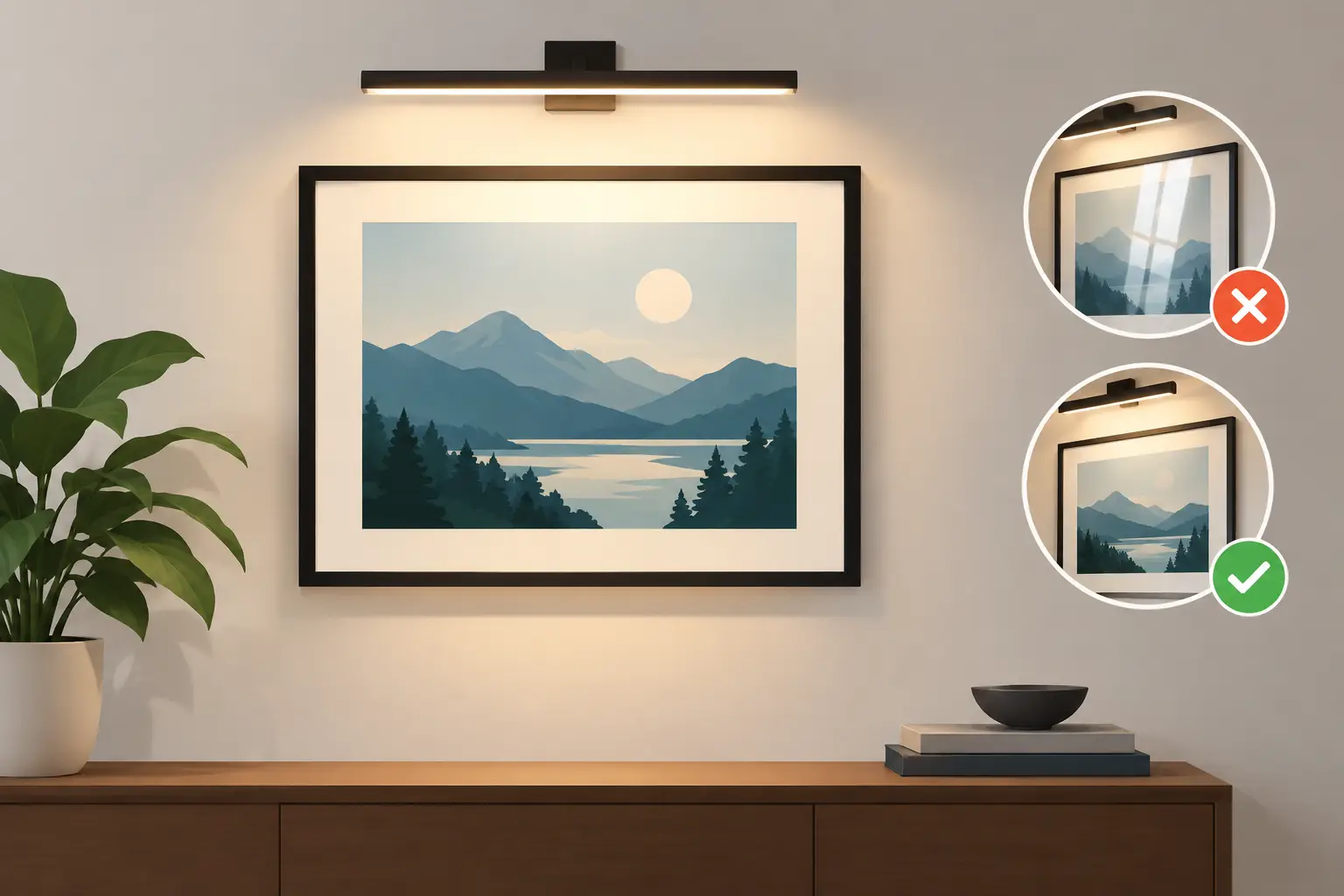
A framed print can look completely different once the light is right. The soft blues in a Monet, the smoky streets of a Lowry or the bright brushwork of a Van Gogh deserve more than the nearest ceiling fitting. Knowing how to light framed artwork helps you see its colour, detail and character clearly, while making a room feel warmer and more considered.
The aim is not to turn your living room into a gallery. It is to give the art enough gentle, well-placed light that it becomes part of the room after dark, without creating reflections on the glass or harsh pools of brightness on the wall.
Why lighting makes such a difference to framed art
Most ready-to-display framed prints have a glass front. Glass protects the artwork and gives it a neat, finished appearance, but it also reflects whatever is opposite it: windows during the day, lamps at night and sometimes the television. A beautiful print can disappear behind a bright reflection if its lighting has not been planned.
Light also affects colour. A very cool white bulb can make cream walls look grey and drain warmth from traditional landscapes, portraits and Impressionist scenes. A bulb that is too dim, meanwhile, can make the print feel like an afterthought, especially above a fireplace, sideboard or hallway console.
The best result usually comes from soft, warm-white LED lighting, aimed carefully rather than simply made brighter. It is a modest change that can make an affordable framed print feel far more intentional in your home.
How to light framed artwork: begin with the room
Before choosing a picture light or changing a bulb, look at the light already in the room. Notice where daylight falls, where you sit in the evening and which surfaces may reflect in the glass. Stand where you would normally view the picture rather than assessing it only from directly underneath.
A print above a sofa faces different challenges from one in a narrow hall. In a sitting room, you may need to prevent reflections from a floor lamp or a large window. In a hallway, the question is often whether the artwork has enough light at all. Bedrooms tend to benefit from softer, more restful illumination, while kitchens and home offices can tolerate a slightly clearer, brighter look.
Also consider the wall colour. Dark painted walls absorb light, so a small framed print may need a little more help to stand out. On a pale wall, gentler lighting is often enough. If you are arranging several pieces as a gallery wall, think of them as one display rather than trying to light every frame separately.
Choose a warm LED bulb with good colour rendering
For most homes, choose an LED bulb in the warm-white range of around 2700K to 3000K. This produces the familiar, welcoming light associated with a good lamp, rather than the blue-white appearance sometimes found in utility spaces. It suits classic art particularly well, from Constable landscapes to Victorian dog portraits and old master reproductions.
Colour rendering matters too. Look for a CRI, or colour rendering index, of 90 or above when possible. A higher CRI helps colours appear more natural, so the green in a landscape, the blush in a portrait or the layered tones in an Impressionist painting are closer to how they should look.
You do not need an extremely powerful bulb. For a single modest-sized framed print, a low-wattage LED is usually more flattering than a bright spotlight. If the fitting is dimmable, even better: you can adjust the effect for daytime, evenings and entertaining.
Position the light at roughly 30 degrees
The angle of the light is the most useful detail to get right. As a general rule, aim light towards the artwork from an angle of around 30 degrees from the wall. This helps illuminate the whole print while reducing glare on glass.
If a light is placed too close to the wall, the top of the frame may be bright while the lower half falls into shadow. If it is positioned too far out, reflections become more likely and the light can spill onto nearby walls or furniture. A fitting mounted above the picture should project forward enough to send light down the face of the artwork, rather than straight down the wall.
There is no single perfect measurement for every room. Hang the picture first, switch the light on and check it from your usual viewing position. Move the shade, change the bulb direction or alter the fitting before committing to a permanent position. A small adjustment can remove an annoying reflection entirely.
Pick the fitting that suits the display
A dedicated picture light is a lovely choice for one favourite piece, particularly above a mantelpiece, desk or sideboard. Choose a fitting that is slightly narrower than the frame rather than one that stretches well beyond it. A warm brass or aged bronze finish can complement traditional prints, while black or brushed metal looks smart with more modern graphic art.
Track lighting is useful if you have several pictures on one wall or like to refresh your arrangement regularly. Adjustable heads let you direct light towards each print, and one ceiling fitting can serve a whole gallery wall. It is practical in hallways, dining rooms and open-plan spaces, though it can look more contemporary than a traditional picture light.
Wall washers are another good option. These fittings cast a broad, even spread of light down a wall, making them especially effective for a large group of frames. They are less focused than spotlights, which can create a calmer effect when the artwork is only one element in the room.
For renters or anyone avoiding electrical work, a nearby table lamp or floor lamp may be all you need. Place it to one side and slightly in front of the picture, then angle the shade away from the glass. It will not give the precise effect of a picture light, but it can create a cosy focal point with no installation required.
Prevent glare on glass-fronted frames
When you notice glare, resist the temptation to add more light. The issue is usually direction, not brightness. Turn off nearby lamps one at a time to identify the source, then try moving the lamp, angling the shade or shifting the artwork slightly higher or lower.
Windows are often the biggest daytime culprit. Avoid hanging glass-fronted artwork directly opposite a large window where possible. If that is the only suitable wall, position the frame so it catches less direct light and use curtains or blinds at the brightest part of the day. Indirect daylight remains lovely for viewing art, but strong sunshine can cause glare and is best kept off the print.
Take care with exposed filament bulbs and bare pendant lights. They may suit an industrial interior, but their bright points of light are easily reflected in glass. A shaded fitting or a bulb tucked behind a diffuser is usually kinder to framed artwork.
Match the lighting to the artwork and mood
Traditional landscapes, heritage portraits and softer French Impressionist scenes tend to look at home under warm, diffused light. A small picture light can make a single classic print feel special without making the room formal. For a cosy reading corner, pair a framed artwork with a table lamp and let both create a gentle pool of light.
Bolder Picasso-inspired shapes, poster-style designs and high-contrast black-and-white art can handle more directional lighting. A neat adjustable spotlight may enhance their graphic quality, particularly against a dark or strongly coloured wall. Even here, check for reflections before deciding the job is finished.
If you have a gallery wall, aim for consistency rather than perfection. Matching the warmth of the light across the wall matters more than giving every frame identical brightness. A mixture of tiny spotlights, very bright bulbs and unlit corners can make the display feel patchy.
Common artwork-lighting mistakes to avoid
The most common mistake is using a ceiling light as the only source. General room lighting is designed to help you move around, not to flatter the wall. It can leave artwork dull, or cast shadows from the frame onto the print.
Another is choosing a bulb purely by brightness. More lumens are not always better. Strong light can flatten subtle colours, create glare and make a small framed piece look oddly theatrical. Start with a modest warm LED and increase brightness only if the artwork still feels lost.
Finally, avoid placing heat-producing fittings close to artwork. LEDs are the sensible choice because they use less energy and run cooler than older bulb types. Keep any light at a comfortable distance from the frame, and follow the fitting manufacturer’s installation guidance, especially around fireplaces and electrical connections.
A well-lit framed print does more than fill an empty wall. It gives a familiar room a point of interest after sunset, whether it is a cherished landscape in the lounge or a cheerful artwork greeting you in the hall. Set the angle, soften the glare and let the picture earn its place in the room.