

Blog
Lowry Prints for Homes Full of Character

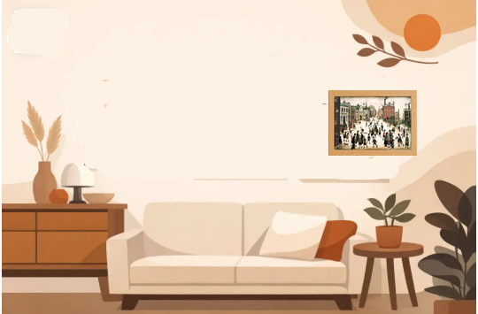
A Lowry print can do far more than fill an empty patch of wall. Those small, purposeful figures, smoky townscapes and matchstick crowds bring a room to life without demanding perfection from the rest of the décor. Whether you are furnishing a first flat, refreshing a family living room or choosing a thoughtful gift, L.S. Lowry’s work has an immediate warmth and recognisable British character.
The appeal is not simply nostalgia. Lowry looked closely at ordinary life: people leaving work, children playing, neighbours gathering, mills rising behind terraced streets. His paintings feel busy and human, which makes them especially good for homes that are meant to be lived in rather than merely admired.
Why Lowry prints still feel at home today
Laurence Stephen Lowry painted the industrial north-west of England in a style that is instantly recognisable. His pale skies, dark buildings and slender figures simplify a scene without making it cold. There is humour in the crowds, but also a real sense of place.
That balance is why Lowry works across so many interiors. In a traditional room, a framed mill scene can sit comfortably alongside wood furniture, heritage colours and patterned textiles. In a more modern space, the graphic lines and restrained palette provide contrast against clean walls, pale flooring and simple furniture.
Lowry is also a particularly approachable choice if you are unsure where to start with art. You do not need to know art history to enjoy the story in a street scene or the energy of a football crowd. A print gives you a familiar visual anchor, while still leaving room for guests to spot new details each time they look.
Choosing the right Lowry print for your room
The best Lowry print is not always the most famous image. Think first about the feeling you want the room to have and the wall space you need to fill. A compact, ready-framed print is often enough to make a bedside table, hallway console or reading corner feel considered.
For living rooms: choose a scene with movement
Living rooms benefit from pictures that invite a second look. A street full of figures, a sporting scene or an industrial landscape with people moving through it can create a natural talking point above a sideboard or beside a bookcase.
If your room already has plenty of colour, Lowry’s muted backgrounds can bring visual calm. If the space is mostly neutral, a print with red, blue or green details can provide a gentle lift without turning the wall into the loudest part of the room.
For hallways: make a small wall memorable
A hallway is often the ideal place for art with personality. It is a passing space, so the picture needs to make an impression quickly. Lowry’s figures and distinctive buildings work beautifully here because the composition reads clearly even when you only have a moment to take it in.
A smaller glass-fronted framed print can sit above a narrow console, next to a coat rack or at the end of a corridor. Keep the surrounding wall uncluttered if you want the image to have greater impact. One well-placed piece is usually stronger than several unrelated decorations competing for attention.
For bedrooms: favour quieter scenes
Not every Lowry scene needs to be bustling. For a bedroom, look for softer skies, open spaces or a calmer view of the town. These pieces still offer character, but they are less visually busy when placed near where you rest.
Try hanging a framed print above a chest of drawers rather than directly over the bed if the bed wall is already occupied by a headboard, lamps or shelving. This creates a small focal point without making the room feel crowded.
How to work with Lowry’s colours
People often think of Lowry solely in greys and browns, but his paintings contain carefully chosen colour. Look closely and you may find cream, dusty blue, brick red, mossy green and deep black. These shades are easy to echo around a room without trying to match every detail exactly.
A cream or off-white wall gives Lowry prints a classic, gallery-like setting. Soft grey walls complement the industrial architecture, while sage green or muted blue can pick up the cooler notes in many scenes. If you prefer a bolder room, use the print as a pause among richer colours such as rust, navy or forest green.
The trick is to repeat one colour from the artwork somewhere nearby. A rust-coloured cushion, charcoal vase or blue throw is enough. Matching every colour can make the scheme feel overly planned, whereas one or two connections make the art look naturally at home.
Framed Lowry prints make decorating simpler
Buying art can seem more complicated than it needs to be. You might find an image you like, then face decisions about paper, mount, frame size, glazing and where to take it for framing. A ready-to-display framed print removes those extra steps.
For compact spaces, a 10 x 13.5-inch framed format is particularly useful. It has enough presence for a small feature wall but will not overwhelm a narrow hallway, alcove or shelf arrangement. Glass-fronted framing also gives the print a smart, finished appearance, making it suitable for a gift as well as your own home.
At Stortvalley, framed fine art prints are chosen to offer that finished look at an accessible price. It means you can enjoy a well-known artist on your wall without treating art as a specialist purchase reserved for formal rooms.
Styling Lowry prints with other artwork
A single Lowry print can happily stand alone, but it also makes an excellent starting point for a gallery wall. The important thing is to create a connection between the pieces. That might be a shared frame colour, a common subject such as British landscapes, or a palette built around black, cream and warm red.
Pair Lowry with a Constable landscape for a conversation between rural and industrial Britain. Add a vintage-style architectural print if you want to emphasise buildings and place. For a more eclectic look, combine the print with family photographs in simple matching frames, keeping enough space between each piece so the arrangement can breathe.
Avoid adding too many highly detailed works next to a busy Lowry crowd scene. One or two quieter pictures will give the arrangement balance. It depends on the size of the wall, of course: a large wall can carry more variety, while a small one may only need two or three carefully chosen frames.
A few placement details that make a difference
Hang your Lowry print at a height that suits the room, rather than automatically placing it as high as possible. As a general rule, the centre of the artwork should sit close to eye level when you are standing. Above furniture, leave a visible gap so the print feels connected to the piece below without looking squeezed against it.
Light matters too. Daylight can bring out the pale tones and small details, but avoid placing artwork where intense direct sun falls on it for long periods. In the evening, a nearby lamp can create a welcoming pool of light and make the picture part of the room after dark.
Most of all, choose the Lowry image that you will enjoy seeing every day. A good print does not need to match every cushion or follow a passing trend. It should make the wall feel like yours: a little more thoughtful, more welcoming and full of life.
2 thoughts on “Lowry Prints for Homes Full of Character”