

Blog
Small Framed Prints for Shelves That Work

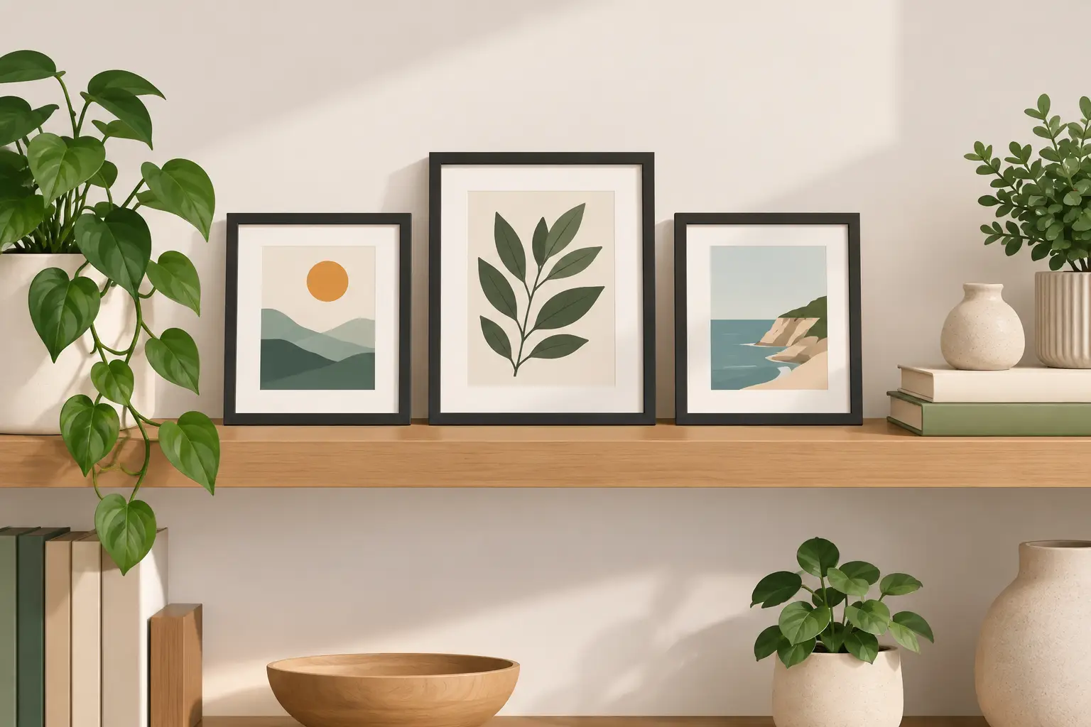
A shelf can look finished with far less than you might think. One compact framed picture, placed beside a stack of books or a favourite ceramic vase, gives the eye somewhere to rest and makes the whole arrangement feel deliberate. Small framed prints for shelves are particularly useful where a large wall picture would feel too formal, too dominant or simply impractical.
They also make familiar art easier to enjoy every day. A small Van Gogh landscape can bring warm movement to a bedside table; a Lowry scene adds character to a bookcase; a Picasso print can lend a clean, graphic note to a contemporary living room. The key is not filling every available surface. It is choosing a print with enough presence to hold its own among the objects you already love.
Why small framed prints suit shelves so well
Shelves are naturally layered spaces. Unlike a blank wall, they already contain books, plants, lamps, photographs and useful household pieces. A compact, glass-fronted framed print introduces colour, pattern and a sense of personal taste without asking you to rearrange the whole room.
The best part is flexibility. You can lean a print against the wall rather than commit to a nail, move it when the seasons change, or bring it down to a desk, mantelpiece or narrow hallway ledge when the room needs a refresh. This makes small art a reassuring choice for renters, first-home decorators and anyone still working out their style.
Ready-framed artwork also removes an awkward extra task. Buying an unframed reproduction can seem inexpensive until you factor in finding the right frame, mount and glazing. A compact framed print arrives with the presentation already considered, so it is easier to place and enjoy straight away.
Start with the shelf, not the picture
Before choosing artwork, look closely at where it will sit. Shelf depth, the wall colour behind it and the other items nearby all affect what will look balanced. A print that appears modest on a product page can feel substantial on a narrow floating shelf, while it may disappear among tall hardbacks on a deep bookcase.
A 10 x 13.5-inch framed format is often a comfortable size for shelving. It is large enough for recognisable detail in a landscape, portrait or classic painting, yet compact enough to layer without swallowing the display. On a slim picture ledge, one print may be all you need. On a wider shelving unit, two or three different-sized pieces can create a more collected look.
Consider the viewing distance too. A shelf display is usually seen from across a room as well as up close. Prints with clear shapes, distinct contrast or a confident colour palette tend to read well from a distance. Delicate details are still rewarding, but they work best where people can stand close, such as a bedside shelf or home-office desk.
Match the mood of the room
You do not need to match every colour exactly. In fact, a little contrast often stops a room looking overly coordinated. Instead, pick up one or two colours that already appear in the room.
For a calm bedroom, soft Impressionist scenes, muted landscapes and floral details can echo bedding, curtains or painted walls without becoming busy. In a living room with navy cushions or dark wood furniture, a Constable sky or a rich Van Gogh palette can provide a lovely lift. For a modern kitchen or hallway, the bolder line and simplified forms of Picasso can create a lively focal point in a small area.
If your room is mostly neutral, artwork is an easy way to introduce colour without replacing furnishings. A gold-toned field, blue water or a red accent in a portrait can make beige, grey and cream surroundings feel warmer and more individual.
How to arrange small framed prints for shelves
Leaning framed prints is one of the simplest styling techniques, but it works best when the arrangement has a little variation. Avoid placing every object along the front edge in a straight, evenly spaced line. Let a print sit slightly behind a shorter object, or rest it against a few books to create depth.
A useful starting point is to group objects in threes: a framed print, a vertical item such as books or a candleholder, and a lower, rounder object such as a bowl or small plant. The pieces do not need to be identical in style. Their heights and shapes simply need to feel different enough to be noticed individually.
Where you have more room, overlap is your friend. Place the larger framed print at the back, then position a smaller print or photograph partially in front. This looks relaxed and collected rather than like a row of miniatures. Keep enough of each image visible for it to earn its place.
Give art some breathing room
A shelf full of treasured possessions can be charming, but framed art needs a little clear space around it to make an impact. If a print is surrounded by several small ornaments, remove one or two and see what changes. Often the display immediately looks more expensive and more considered.
This matters especially with recognisable paintings. The scene in a Lowry print, the brushwork in a Monet or the expressive colour of Van Gogh deserves to be seen, rather than treated as background decoration. One well-positioned picture can say more than five tiny objects competing for attention.
If you are styling open shelving in a busy room, repeat one material to bring the arrangement together. A black or dark frame may connect with lamp bases and picture frames elsewhere; a light frame can soften pale timber and linen. Glass-fronted frames add a neat, finished quality, although they can catch glare opposite a strong window. In that case, angle the print slightly or place it on a shelf that receives gentler light.
Choose artwork with a story
Small shelf art has the advantage of being close enough to invite conversation. It is worth choosing images you will still enjoy after the initial room refresh. Well-known artists are a natural place to begin because their work offers both visual appeal and an easy point of connection.
British scenes by L.S. Lowry suit homes that favour heritage, urban character and a touch of Northern spirit. His figures and streetscapes have a distinctive simplicity that works surprisingly well with both traditional and modern furniture. John Constable is a strong choice for country-inspired interiors, green accents and rooms that need a little sky and openness.
For colour-led decorating, French Impressionist prints are wonderfully adaptable. Water, gardens and lively brushstrokes can brighten a shelf without looking harsh. Van Gogh offers stronger movement and richer tones, while Picasso can be ideal for a more graphic display built around black, white, terracotta or primary colours.
Sentimental subjects also have their place. Victorian images, classic portraits and Charles Burton Barber’s much-loved scenes can make a thoughtful gift for a family member, a pet lover or someone furnishing a more traditional home. Art does not have to be rare or obscure to feel personal. A familiar image that makes somebody smile has done its job.
Common shelf-styling mistakes to avoid
The most common mistake is choosing art that is too small for its surroundings. A tiny frame can be lost beside a large lamp, wide television or tall stack of books. Rather than adding more miniature pieces, try one slightly larger compact print and let it become the visual anchor.
Another is placing every frame at the same height. When several prints are lined up with matching tops and no overlap, the result can feel more like a shop display than part of a home. Varying the height, angle and depth makes the arrangement feel lived in.
Finally, do not overlook practical stability. Leaning frames should sit on a firm, level surface, away from the edge of the shelf and out of reach of curious children or pets. On frequently used shelves, a small non-slip grip beneath the frame can help keep it steady without affecting the look.
Refresh a shelf without redecorating
One of the pleasures of compact framed art is that it lets you change the feeling of a room in minutes. Move a bright floral or garden scene into the living room during spring and summer, then bring in deeper landscapes, portraits or architectural prints when evenings draw in. You are not required to follow seasonal rules, of course, but rotating a few pieces keeps familiar rooms from feeling stale.
Try taking one print from a busy shelf and giving it a quieter spot for a week. Place it on a bedside table, a mantelpiece or a kitchen ledge, then notice how the room feels when the artwork has space to speak. Affordable, ready-to-display prints from Stortvalley make this kind of experimentation easy: a small change can turn an overlooked shelf into a favourite part of the home.