

Blog
How to Match Art Colours Around Your Home

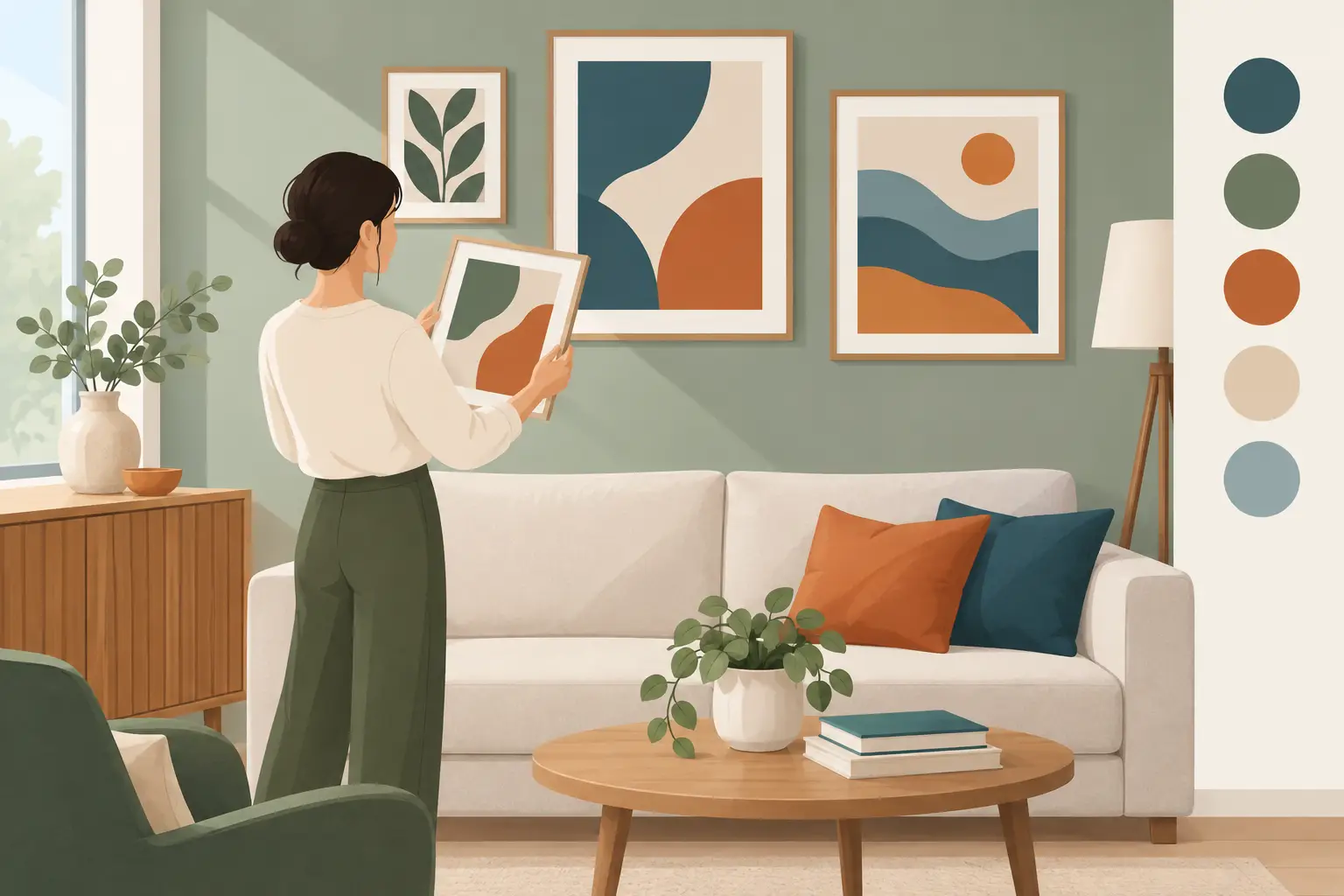
A framed print can bring a room together surprisingly quickly – but only when its colours feel at home on the wall. If you are wondering how to match art colours, do not start by searching for a picture in the exact shade of your cushions. Start by looking for a colour relationship that feels deliberate. The best rooms have a little repetition, a little contrast and enough breathing space for the artwork to be noticed.
A Van Gogh landscape may pick up the mustard in a lamp base. A Lowry print can sit beautifully against soft grey, charcoal or warm cream. A bright Picasso might become the lively note in an otherwise calm room. The aim is not to make every item identical. It is to make the art look chosen for the room rather than added as an afterthought.
Start with the colours already doing the work
Before choosing a print, stand in the room and identify the colours you see most often. Look beyond the obvious wall paint. Flooring, curtains, rugs, upholstered furniture, wood finishes and even books on a shelf all influence the overall palette.
Choose one main colour and one or two supporting shades. In a living room with a sage sofa, oak furniture and cream walls, sage may be the main colour, while warm beige and brown are supporting tones. You do not need art containing all three, but a print that includes one of them will usually feel connected to the scheme.
This approach is especially useful in neutral rooms. Cream, stone and grey can look elegant, but they can also make a wall feel unfinished. A framed Impressionist garden scene with greens, blues and soft pinks adds interest while still working with a quiet backdrop. Conversely, if the room already contains patterned curtains or a colourful rug, a more restrained landscape or monochrome-style print can give the eye somewhere to rest.
How to match art colours without making everything match
The easiest rule is to repeat a shade from the artwork elsewhere in the room, but repeat it lightly. Choose a colour that is present in the print rather than necessarily its most dominant hue. A small flash of red in a royal portrait, for example, could be echoed with a single cushion, a vase or a stack of books. That small connection makes the picture feel settled without turning the room into a colour-themed set.
Think in three possible directions: harmony, contrast and bridge colours.
Use harmony for a calm, collected look
Harmonious colours sit close together on the colour wheel. Blues, blue-greens and soft greens work naturally together, as do rust, terracotta and muted gold. This is a good route for bedrooms, reading corners and smaller spaces where you want a restful feel.
A Constable sky scene can work particularly well with pale blue walls, linen curtains and weathered wood. It does not need to be a perfect blue-on-blue match. In fact, a slight difference in tone stops the room feeling flat. A smoky blue wall may make a print with brighter cloud tones stand out beautifully.
Use contrast when the room needs energy
Contrasting colours make art more of a focal point. A blue-heavy print against a warm terracotta, clay or blush wall can look striking. Yellow and violet, red and green, and blue and orange are classic contrasts, although you do not need to use their brightest versions.
The trade-off is that contrast attracts attention. That is ideal above a fireplace, sofa or hallway console, where you want the artwork to lead the eye. In a compact bedroom already filled with colour, it may feel too busy. Soften the effect by choosing a print with plenty of neutral space, or keep the rest of the accessories simple.
Let neutral shades act as the bridge
Black, white, cream, grey, brown and natural wood are not an absence of colour. They are often what allows a brighter artwork to fit into a room. A black-framed Picasso print can tie in with black lamp bases, picture rails or furniture legs, even if the image itself is full of vivid colour.
This is also why frame choice matters. A dark frame gives a picture definition and can ground a pale wall. A lighter frame feels gentler and may suit traditional, airy or Scandi-inspired interiors. If several prints will share one wall, matching frame finishes is usually more useful than trying to make every image use the same palette.
Choose a lead shade from the artwork
Once you have found a print you love, look at it from a few steps back. Which colour do you notice first? That is often the lead shade. It may be the blue in a sea view, the green in a landscape or the warm ochre in a village scene.
Bring that shade into the room once or twice, using different textures. A blue painting might sit above a sofa with a navy velvet cushion and a blue-grey ceramic vase. The colours do not have to be identical because texture changes how colour is perceived. Velvet appears deeper, linen appears softer and glazed ceramics can look more vivid.
Avoid repeating every colour in a busy artwork. French Impressionist prints often contain many subtle shades – lilac, green, cream, rose, blue and yellow all in one scene. Select one or two to echo, then allow the rest to remain special to the picture. The art should retain its own character.
Consider the wall colour, but do not be ruled by it
White and off-white walls are forgiving, which is why they suit almost every subject. They allow a colourful painting to take centre stage and give darker framed prints a crisp outline. Warm whites tend to flatter traditional landscapes, Victorian scenes and golden-toned classic art, while cooler whites can suit bolder modern works.
With coloured walls, the decision depends on whether you want the print to blend or stand out. A landscape with green tones against a deep green wall can look rich and sophisticated, particularly when the frame creates a clear edge. Yet a very dark artwork on a very dark wall may disappear in a dim room. If that is the look you want, make sure nearby lighting gives the glass-fronted frame a gentle, even glow rather than a harsh reflection.
Do not dismiss patterned wallpaper either. A small-scale, muted pattern can be an excellent backdrop for a simple framed print. The key is visual hierarchy: if the wallpaper is busy, select artwork with a clear main subject and avoid competing patterns in the frame or surrounding accessories.
Match artwork to the mood of each room
Colour does more than coordinate a scheme. It changes how a room feels. Bedrooms often suit softer palettes – misty blue, muted green, warm pink, lavender and cream. A peaceful coastal scene, floral study or gentle landscape can reinforce that slower mood.
Living rooms can handle a broader range. Here, a recognisable work by Van Gogh, Picasso or Lowry can start a conversation while picking up colours from the furnishings. If the space is used mainly in the evening, warmer shades such as ochre, deep red and amber often feel especially inviting under lamplight.
Hallways are useful places for braver choices because people pass through rather than sit with the colour for hours. A vivid abstract or a formal royal portrait can create immediate impact. In dining areas, rich blues, reds and greens can feel sociable and warm, while a traditional still life or classic art print gives the room a sense of occasion without requiring expensive original artwork.
Build a gallery wall with a shared colour thread
A gallery wall does not need matching subjects. In fact, a mixture of landscapes, portraits and graphic artwork often looks more personal. What it needs is one visual thread. That might be a shared frame colour, a repeated warm neutral, a blue accent or a similar level of contrast.
Lay the prints on the floor first and look for balance. Put the strongest colours where you want attention, then place quieter pictures nearby. If one print contains intense red or bright yellow, give it room. Surrounding it with equally bold images can make the arrangement feel scattered.
For a more relaxed gallery wall, choose pictures from the same broad mood rather than the same exact palette. A soft Constable landscape, a faded botanical print and a muted portrait can sit together through their gentle, timeworn tones. For a sharper, more modern result, combine bold graphic art with black frames and a small repeat of one bright colour.
A simple test before you hang the print
Hold the framed artwork against the intended wall at different times of day. Morning light can make blues look clearer; evening bulbs may bring out warmer yellows and browns. Take a quick photograph as well. A camera often reveals whether the colours feel connected or whether one item is shouting louder than intended.
If the print feels slightly separate, do not assume you chose badly. Try moving a cushion, adding a small object in a related shade or changing the nearby lampshade. Small adjustments can make a ready-to-display framed print look as though it has always belonged there.
The most successful choice is still the artwork you want to look at every day. Let colour help it settle into the room, then give it enough space to tell its own story.