

Blog
How to Create a Focal Point With Artwork

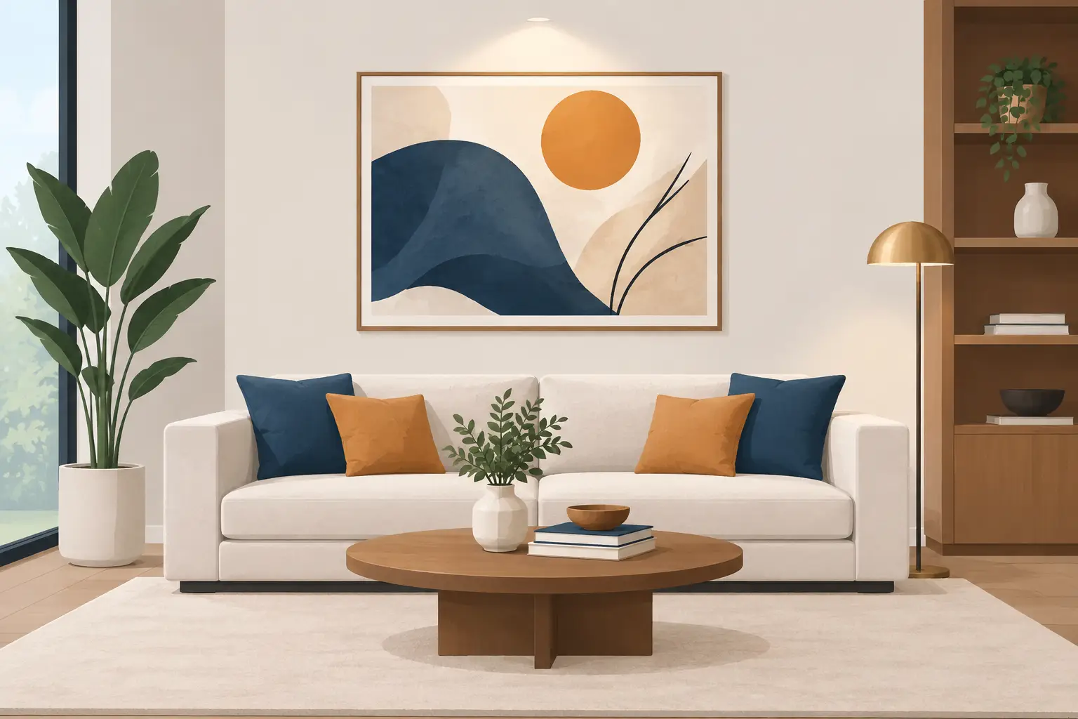
A blank wall does not always need filling. Sometimes it needs one well-chosen picture in exactly the right place. To create a focal point with artwork is to give the eye somewhere to land when it enters a room, whether that is a colourful Van Gogh above the sofa, a calm Constable landscape over a mantelpiece, or a characterful Lowry print in a hallway.
The best part is that a focal point is not reserved for large houses or costly original paintings. A ready-to-display framed print can make a real difference, especially when its subject, size and position work with the room rather than against it. Here is how to make one piece of art feel intentional and bring the rest of your decorating scheme together.
What makes artwork a focal point?
A focal point is the feature that naturally receives attention first. In a living room, it may be the fireplace, the view from a window or the wall behind the sofa. In a bedroom, it is often the space above the bed. Artwork earns this role through contrast, scale, colour or an engaging subject.
That does not necessarily mean choosing the loudest image in the room. A softly coloured Impressionist scene can become the main feature in a neutral room because it adds depth and atmosphere. Equally, a bold Picasso can command attention through line, shape and confident use of colour. The aim is not to make every surface compete. It is to give the room a clear visual starting point.
Before choosing a print, stand at the entrance to the room and notice where your eyes go naturally. This is usually the strongest place for art. If the room already has a striking fireplace or patterned wallpaper, your artwork may be better as a supporting feature. If the space feels plain or scattered, a framed print can provide the definition it is missing.
Choose artwork with enough presence
Size is often the deciding factor. A small picture placed alone on a broad wall can look lost, however beautiful the image may be. It is not a reason to avoid compact framed prints, but it does mean being thoughtful about placement. A 10 x 13.5-inch framed print can make a charming focal point above a bedside table, on a narrow hallway wall, beside a reading chair or as part of a carefully planned arrangement.
For a wide sofa or bed, one compact print may need company. Try placing it with two related pieces, keeping the frames aligned and the gaps even. This creates a single composed feature rather than three separate pictures floating on the wall. A collection of French Impressionist prints, for example, can give a room colour and softness without requiring one oversized image.
Subject matters too. Choose an image with a clear mood or recognisable focal detail. Van Gogh’s swirling skies and expressive brushwork suit rooms that need energy. John Constable’s open landscapes can make a smaller room feel calmer and more spacious. L.S. Lowry’s distinctive figures and industrial scenes offer a talking point in kitchens, studies and hallways, while a royal portrait can bring formality to a dining area or period-style interior.
It depends on the effect you want. A portrait meets the viewer’s gaze and feels more dramatic. A landscape gives the eye somewhere to travel. Floral art and still life can introduce warmth without becoming too formal.
Let the room guide the colours
You do not need to match every shade in a print to your cushions and curtains. In fact, a little contrast is often what makes a focal point work. Instead, pick out one or two colours from the artwork and repeat them gently elsewhere in the room.
A print with deep blue can sit beautifully above a cream sofa, then connect to a navy cushion or a blue vase on a nearby shelf. A warm-toned Victorian dog portrait might bring out the russet shades in a timber side table or a terracotta throw. This light repetition makes the art feel part of the scheme without turning the room into a colour chart.
If your walls are dark, choose a print with a pale mount or a light, open image to create contrast. On white or pale grey walls, richer colours and darker frames can give the artwork more definition. Glass-fronted framed prints are particularly useful here, as the finished edge helps an image stand out from the wall straight away.
Place it where people can properly see it
Hanging height can make an excellent print look oddly disconnected. As a general guide, position the centre of the artwork at around eye level, roughly 145 to 150 cm from the floor. In a room where everyone is usually seated, such as a lounge, it can sit slightly lower.
Above furniture, leave a visible connection between the two. Around 15 to 20 cm above the top of a sofa, headboard, console table or mantelpiece is a useful starting point. If the gap is too large, the print can appear to be drifting upwards. If it is too close, the arrangement may feel cramped.
Use the furniture below to judge the width as well. Artwork or an art grouping usually looks most balanced when it spans around two-thirds of the furniture beneath it. That is a guide rather than a rule, particularly in older homes with alcoves, beams and fireplaces, but it prevents the common problem of a tiny picture above a long sofa.
Hallways deserve special attention. They are often passed through quickly, so a framed print with a strong subject can make the space feel welcoming from the moment you come home. Hang it where it can be seen from the front door or at the end of a corridor. A single piece at the end of a sightline has more impact than several unrelated pictures spread along every wall.
Use framing and lighting to finish the effect
A frame is not merely practical. It separates the image from the wall and signals that it has a place in the room. A simple dark frame can bring definition to a pale landscape, while a lighter frame keeps an airy image feeling relaxed. When creating a group, matching frames make different subjects feel more connected. Mixing frame styles can work, but it needs a common thread, such as a shared colour palette or similar print sizes.
Light changes how artwork reads. Avoid placing glass-fronted prints where strong direct sunlight will cause glare or fade surrounding furnishings. If your main wall is dim, a nearby table lamp or picture light can help the art hold its place in the evening. You do not need gallery-style spotlights for every print. Often, warm ambient lighting is enough to make the frame and colours feel inviting.
Build a focal point around the artwork
Once the picture is hung, resist the urge to crowd it. The empty wall around a focal-point print is part of what gives it importance. Keep nearby accessories simple: perhaps a lamp, a plant or a small stack of books beneath it. The artwork should lead, while the objects around it add texture.
If you are working with a gallery wall, treat the whole collection as the focal point. Start with one anchor image – perhaps a favourite Picasso, classic landscape or sentimental portrait – then build around it. Lay the arrangement on the floor first and keep the spacing consistent, usually around 5 to 8 cm. A closely arranged group reads as one statement; large irregular gaps make it look accidental.
Stortvalley’s affordable framed prints are especially suited to this approach because you can combine familiar artists and subjects without the extra task of choosing separate frames. A pair of complementary prints can transform an empty space more convincingly than one piece chosen in a hurry.
The most successful focal points feel personal, not staged. Choose artwork you will still enjoy looking at on an ordinary Tuesday morning, then give it the breathing room and position it deserves. One framed image, thoughtfully placed, can make the whole room feel more like home.