

Blog
Cheap Artwork for a First Home That Looks Considered

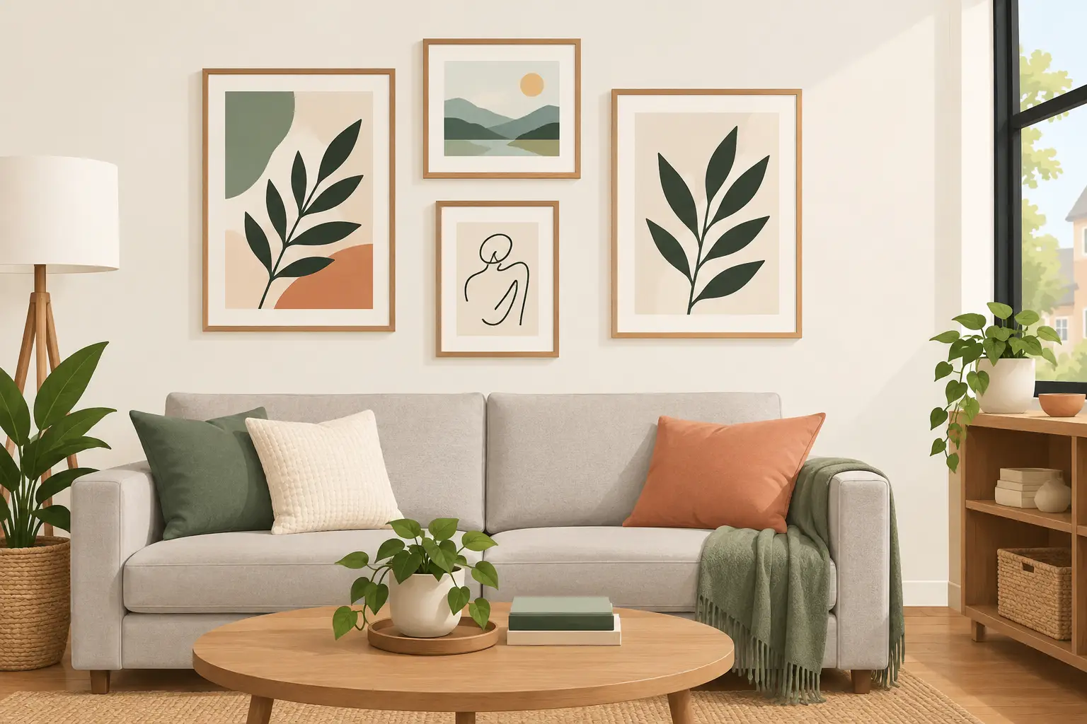
A first home has a particular sort of blank wall: one that asks to feel personal without asking you to spend the deposit all over again. Cheap artwork for first home decorating is not about filling every available space with whatever happens to match the sofa. It is about choosing a few images you genuinely enjoy, putting them where they will be seen, and making the room feel settled sooner.
The good news is that a modest budget can still bring well-known artists, beautiful landscapes and characterful portraits into your home. A framed print of a familiar work has visual weight straight away. It also saves the extra cost and effort of finding a frame, fitting a mount and hoping the finished result looks right together.
Start with the wall, not the artist
It is tempting to begin with a favourite name. Perhaps you have always liked Van Gogh’s colour, Lowry’s figures, or the quieter charm of a Constable landscape. Those are excellent starting points, but look at the room first. The wall’s size, the furniture beneath it and the light it receives will tell you what kind of image can do its best work there.
Above a compact two-seat sofa, one small framed print may look a little lost. A pair of related pictures, hung with a narrow gap, will feel more intentional. On a slim stretch of wall beside a bookcase or hallway mirror, one 10 x 13.5-inch framed print can be exactly enough. Small formats are especially useful in a first property, where rooms may be modest and layouts can change as you get settled.
Think about where your eye naturally lands when you enter. That is often the right place for your most expressive piece: a bright Impressionist scene, a Picasso-inspired graphic image or a royal portrait with presence. Art does not have to be large to become a focal point. It simply needs enough contrast, colour or subject matter to hold attention.
Cheap artwork for first home rooms
Different rooms ask for different moods. You do not need a strict theme throughout the house, but choosing art that suits how a room is used makes the whole space more comfortable.
Living room: choose conversation starters
The living room can carry the piece with the most personality. A classic art print gives guests something recognisable to notice, even if they do not know much about art. Vincent van Gogh’s energetic brushwork adds warmth and movement, while French Impressionist scenes bring softer colour and a relaxed, lived-in feel.
If your furniture is neutral, art is a simple way to introduce blue, yellow, terracotta or green without committing to a new rug or curtains. Pick up one colour from the print in a cushion, vase or throw, but do not feel obliged to match everything exactly. A room looks more natural when the colours relate rather than repeat.
Bedroom: favour calm over impact
Bedrooms benefit from images you will be pleased to see at the beginning and end of the day. Landscapes, gardens, gentle coastal scenes and softer portraiture work particularly well. A John Constable sky or a quiet Impressionist study can make a plain bedroom feel less temporary, even when the rest of the furnishing is still a work in progress.
Keep the scale comfortable. One print above a bedside table, or a balanced pair above the bed, often looks better than an oversized arrangement in a small room. Hang pictures low enough to connect with the furniture rather than floating near the ceiling.
Hallway and kitchen: use the overlooked spaces
A narrow hall does not need to remain a passageway with nothing to see. It is the first part of your home that visitors experience, so it is an ideal spot for a small framed classic or a cheerful decorative subject. Lowry prints can be especially effective here: their scenes have narrative detail, rewarding a closer look as you pass.
Kitchens suit art too, provided the picture is away from steam and direct splashes. A glass-fronted framed print is a practical choice for everyday rooms, and a small piece can add colour above a breakfast table or on an open shelf. Victorian dog portraits, botanical subjects and lively café scenes tend to bring a friendly note without making the room feel overly formal.
Buy framed when the budget needs certainty
A cheap print is not always cheap once you add a frame. Separate framing can cost more than the image itself, particularly if you need an unusual size or want a glass front. For a first home, ready-to-display framed art is often the straightforward option because you know the finished cost before it arrives.
It also removes a surprisingly common decorating delay: the pile of unframed prints that stays in a drawer while you mean to find the right frames. A compact framed piece can go from parcel to wall quickly, which matters when you are trying to make a new place feel like yours.
There is a trade-off. Ready-framed prints may offer fewer choices of frame finish or mount than a bespoke service. But when the aim is attractive, affordable wall art rather than museum-style presentation, a simple frame usually lets the image take centre stage. At Stortvalley, familiar art is offered in display-ready framed formats that make this decision easier.
Build a small gallery wall slowly
A gallery wall does not have to begin as a grand plan. In fact, it is often better when it grows over time. Start with two or three pictures that have something in common: a shared colour, similar frame finish, related subject or a mix of classic artists from the same broad period. Then leave room to add later.
Before making holes in the wall, arrange the frames on the floor or cut paper templates to their sizes. This shows you whether the group needs more breathing room. For compact pictures, gaps of around 5 to 8 cm usually feel tidy. Keep the visual centre of the arrangement at approximately eye level, rather than measuring every frame from the ceiling.
There are two reliable approaches. A symmetrical arrangement, such as two prints in a row or a neat grid, suits calm and orderly interiors. A looser cluster feels more collected and works well on stairways or around a favourite central image. Neither is better. It depends on the room and whether you prefer a polished or more personal look.
Do not add pieces simply to make the wall bigger. A gallery wall with four pictures you like will always look better than one with eight filler images. Empty wall space is useful. It gives each framed print room to be noticed.
Let colour guide you when taste feels uncertain
If choosing art feels intimidating, begin with colours already in the room. A blue-grey wall might suit a pale landscape, a coastal scene or an Impressionist painting with cool shadows. Warm beige, cream and timber furniture can handle richer golds, rusts and greens. For a black, white or charcoal scheme, a print with one strong colour can stop the room feeling flat.
This does not mean your artwork must blend in. Sometimes a deliberately contrasting image is the thing that makes a room memorable. A vivid Van Gogh-style yellow against deep blue walls, or a pale classical portrait against a darker paint colour, can create a confident focal point. The key is to repeat a small note of that contrast somewhere else, perhaps in a book cover, lampshade or cushion.
When in doubt, choose an image with a colour you would be happy to live with for years. Trends move quickly, but a favourite landscape or an artist whose work keeps drawing you back will outlast a fashionable accent shade.
Make the first choice an easy one
Your first artwork does not need to define the whole house. It only needs to make one corner feel more like home. Choose a framed image that suits the room, hang it at a sensible height and live with it for a while. The next decision becomes easier once the first blank wall has a little colour, story and character.