

Blog
How to Create a Gallery Wall That Feels Personal

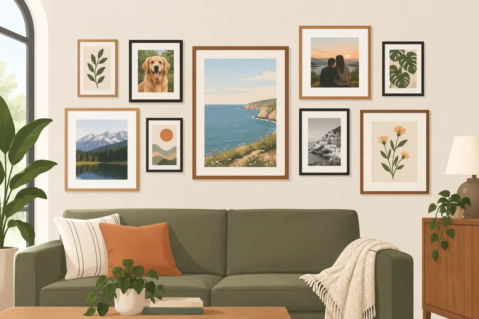
A blank wall can make a room feel unfinished, even when the furniture is in place. A gallery wall changes that quickly: it gives favourite images a home, brings colour up to eye level and makes a living room, hallway or bedroom feel properly yours. The good news is that learning how to create a gallery wall does not require an art degree, expensive originals or perfectly matching frames.
The most inviting displays usually look collected rather than copied. A Van Gogh landscape beside a soft French Impressionist scene, a graphic Picasso print paired with a British classic, or a group of treasured family photographs can all work beautifully. What matters is giving the arrangement a clear thread, then allowing a little personality around the edges.
Start with the wall, not the artwork
Before choosing prints, look at where the gallery wall will live. Its position affects the scale, mood and practical arrangement more than most people expect. A large wall above a sofa can carry a generous, landscape-led display. A narrow hall benefits from a vertical run of smaller framed pieces. Over a bedside table, a compact pair or trio may have more impact than a sprawling arrangement.
Measure the usable space rather than the whole wall. If the display sits above furniture, aim for it to occupy roughly two-thirds to three-quarters of the furniture width. This keeps the art connected to the sofa, sideboard or bed beneath it, rather than appearing to float far above.
Also consider how the room is used. A busy family hallway is a lovely place for cheerful, familiar art, but glass-fronted frames should be hung securely and away from areas where bags or doors might knock them. In a calm bedroom, gentler colours, coastal scenes or Impressionist gardens can make the space feel more restful.
Choose one idea to hold the gallery wall together
A gallery wall does not need every print to match, but it does need a relationship between the pieces. Choose one unifying idea before you shop or start laying frames out. It might be a colour palette, an artist, a period of art, a subject or a frame finish.
For example, you could combine Lowry’s recognisable industrial scenes with other British heritage images in black frames for a characterful sitting room. Or build around soft blues and greens using Constable skies, Monet-like garden scenes and botanical subjects. If you prefer something bolder, Picasso-inspired line work, modern portraits and warm abstract details can create a more graphic look.
The simplest route is often to keep the frame colour consistent. A run of black, white or natural wood-effect frames lets a mixture of subjects sit together comfortably. Ready-to-display framed prints are especially useful here: the framing decision is already made, so you can focus on which images speak to one another and to your room.
Do not feel tied to one artist. A wall made entirely from the same painter can look striking, particularly in a dining room or study, but it can also feel formal. Mixing well-known art with personal photographs, postcards or a child’s drawing can make the finished display warmer. The trade-off is that a mixed wall needs a stronger shared element, such as matching frames or a repeated colour.
How to create a gallery wall layout before making holes
The easiest way to avoid unnecessary nail holes is to plan the full arrangement on the floor first. Clear an area roughly the same size as the wall space, then place your frames down and move them around until the group feels balanced. Take a photograph once you have a layout you like. It is much easier to judge the overall shape from above than when you are holding frames against the wall.
Start with the largest or most colourful piece. This is your visual anchor, not necessarily the centre of the entire wall. For a relaxed, asymmetrical display, place it slightly off-centre and build outward with smaller pieces. For a more orderly look, arrange frames around an invisible centre line, keeping the top or bottom edges aligned.
Paper templates make the next stage far less stressful. Draw around each frame on plain paper, cut out the shapes and use low-tack tape to position them on the wall. Step back several times and view the layout from the doorway, from the sofa and in daylight. A design that looks balanced up close can feel too high or too scattered from across the room.
Leave consistent gaps between frames. Around 5 to 8 cm is a reliable starting point for compact framed prints. Tighter gaps make individual pieces read as one confident collection; wider gaps give each print more breathing room but can make a small arrangement feel disconnected. The right spacing depends on the frame size and available wall, so trust the view from a distance.
Hang at a comfortable viewing height
For artwork on an open wall, the centre of the overall arrangement should generally sit close to eye level, around 145 cm from the floor. Above furniture, bring the display lower than you may first think. Leaving a gap of approximately 15 to 25 cm above a sofa, sideboard or headboard usually helps it feel intentional.
Use a tape measure and spirit level, particularly when you want clean rows. Check where the hanger sits on the back of every frame before marking the wall. The top of the frame is not where the nail will go, and this small detail is responsible for many wonky first attempts.
The fixing itself depends on your wall. Picture hooks are often suitable for lighter framed prints on plaster walls, while masonry walls may need a drill, wall plug and screw. Adhesive strips can be useful in rented homes, but always check the weight limit and surface guidance. They are not the best choice for every paint finish or for frames exposed to changing temperatures.
Make colour work across the room
Art looks most at home when it picks up colours already present in the room. You do not need a perfect match. A blue-grey sky can echo cushions, a warm ochre detail can relate to a lampshade, and a touch of blush in a portrait can soften a neutral bedroom.
If your room is already full of pattern, choose a quieter art palette and let the frames create the interest. If the room is mostly plain, a gallery wall can become the focal point, so be braver with colour and contrast. A bright post-Impressionist print or a richly painted royal portrait can add character to beige, grey or white surroundings without requiring a complete redecorating project.
Lighting deserves attention too. Daylight will change the appearance of a print throughout the day, while a nearby table lamp can make a wall feel particularly welcoming in the evening. Avoid hanging framed art where direct, harsh sunlight falls for long periods, as it may affect colours over time.
Give the display room to grow
The best gallery walls are not always finished in one afternoon. Begin with four to six pieces that work well together, then live with them for a few weeks. You may find that the wall needs one more landscape to widen the composition, a smaller portrait to fill a gap or a personal photograph to stop it feeling too curated.
For a first display, a set of similarly sized framed prints is a reassuring place to start. Compact 10 x 13.5-inch frames are easy to arrange in pairs, grids or looser clusters, and they offer plenty of impact without needing a huge wall. Stortvalley’s ready-framed art prints make this particularly straightforward, with familiar artists and classic subjects ready to hang once you have chosen your arrangement.
A gallery wall should not look like a showroom unless that is genuinely your style. Let it reflect the places you love, colours you enjoy and images that make you pause. When each piece has been chosen with a little care, even an ordinary stretch of wall can become the part of the room guests remember.